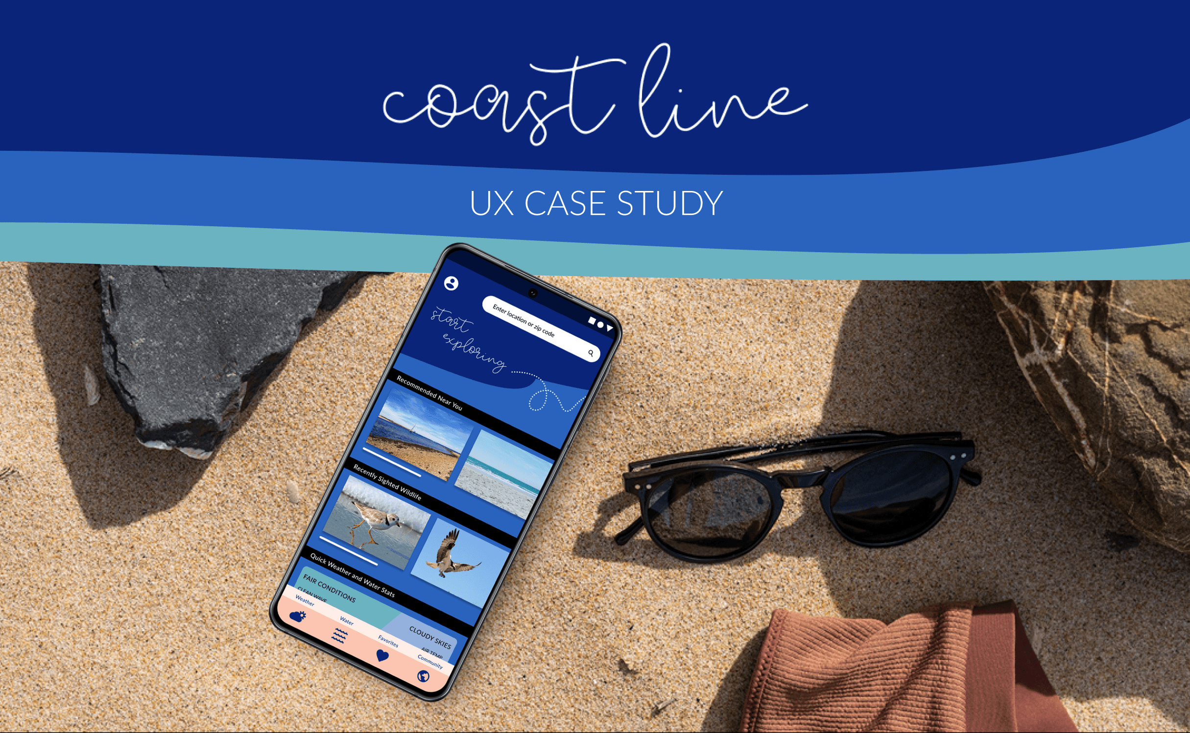
PROJECT OVERVIEW
A mobile-first weather app for water sport enthusiasts that puts user safety as priority while remaining true to their spirit of exploration.
my role
sole ux/ui designer
timeline
one year
tools
Figma, Canva, FlowMapp, OptimalSort, UsabilityHub

ORIGINAL PROBLEM STATEMENT
The water sport enthusiast needs a way to succinctly view and digest multiple data points about wind, wave, and weather conditions because they want to maximize time spent enjoying the water and be safe doing so.
COMPETITIVE ANALYSIS
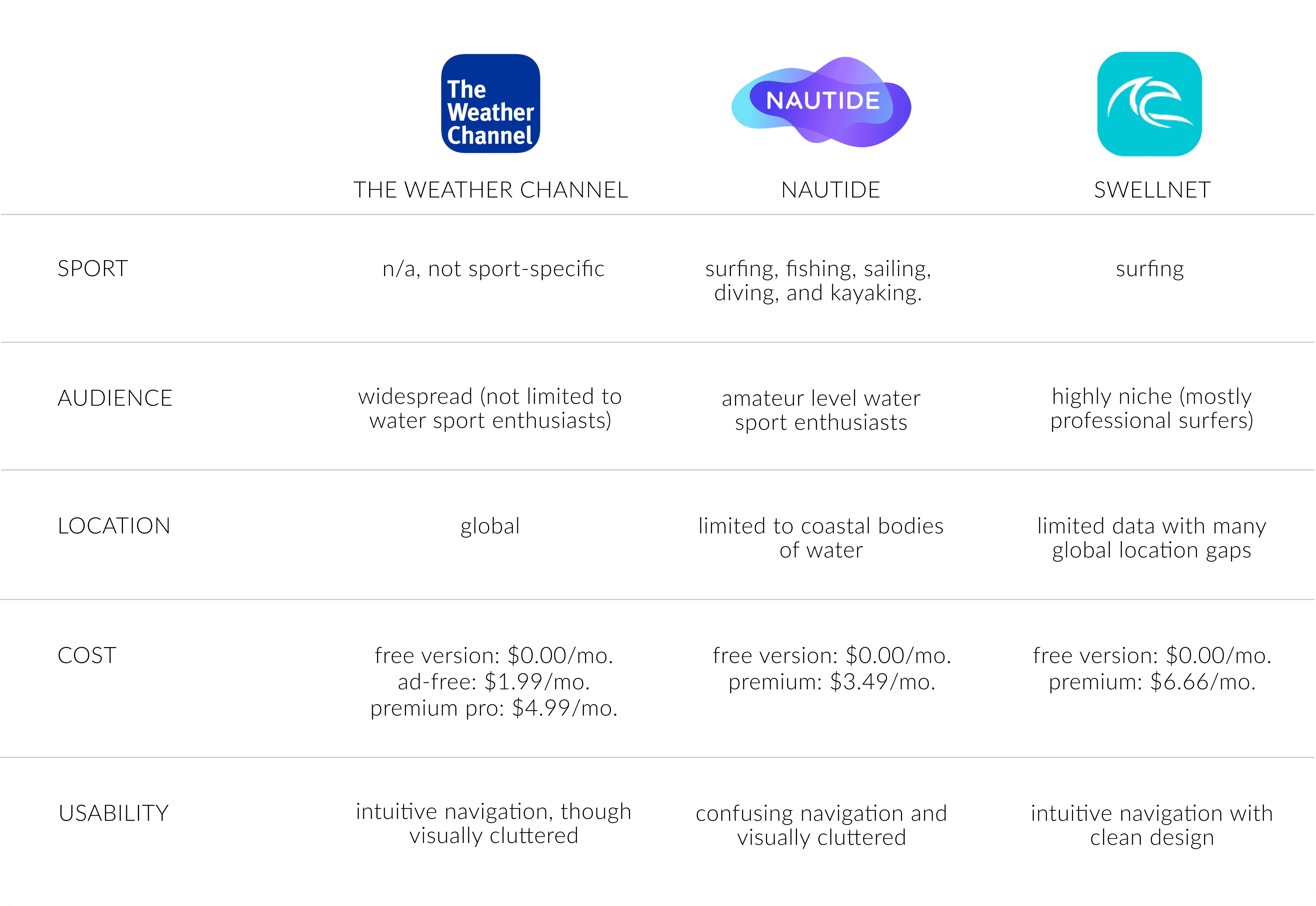
To begin my understanding of the problem, I conducted a competitive analysis on three responsive web apps that are currently operating in the same space.
USER PERSONAS
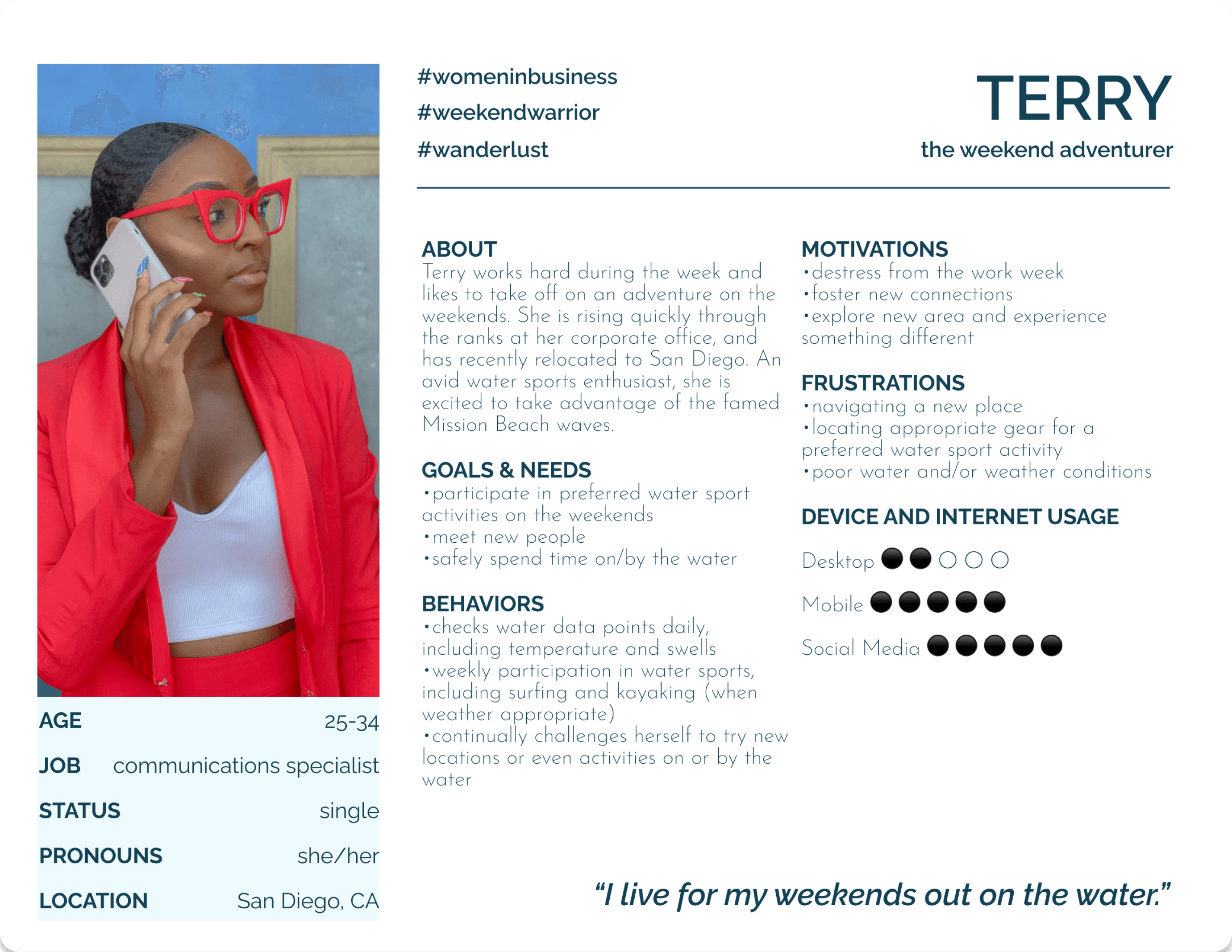
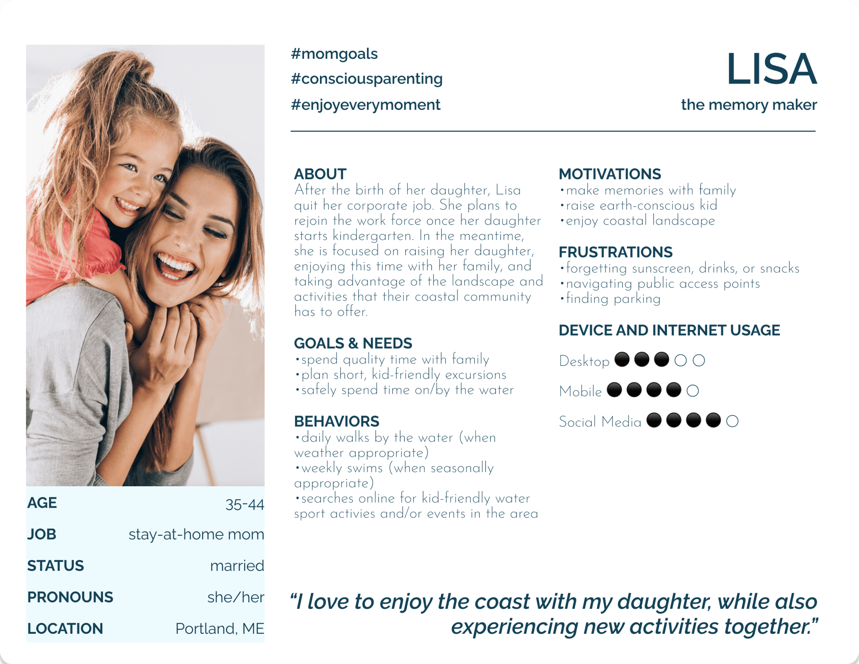
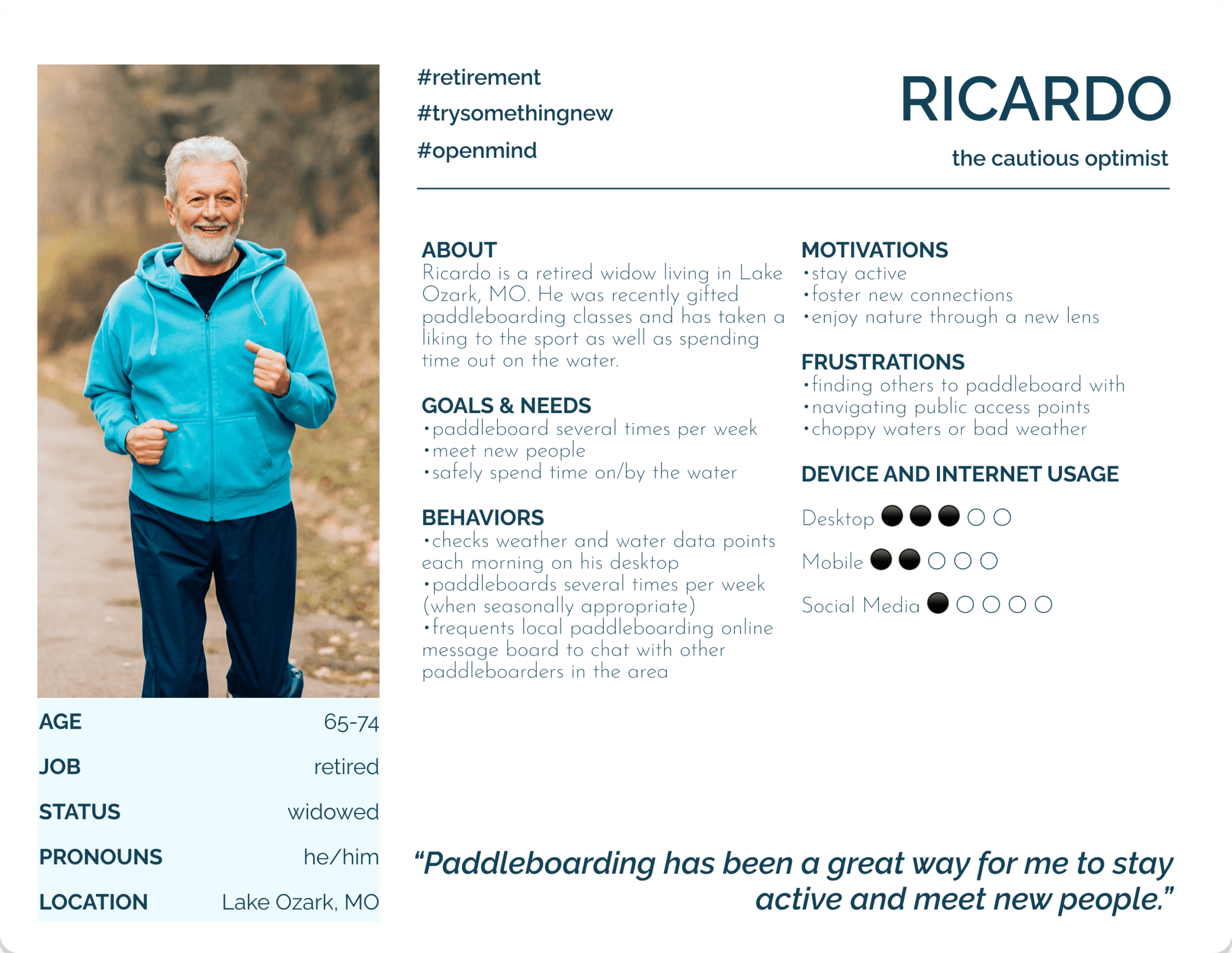
I created three user personas based upon an amalgamation of research interviews. By asking open questions, I learned about the behaviors, needs and goals, and pain points that occur when users plan a day on the water.
USER FLOWS
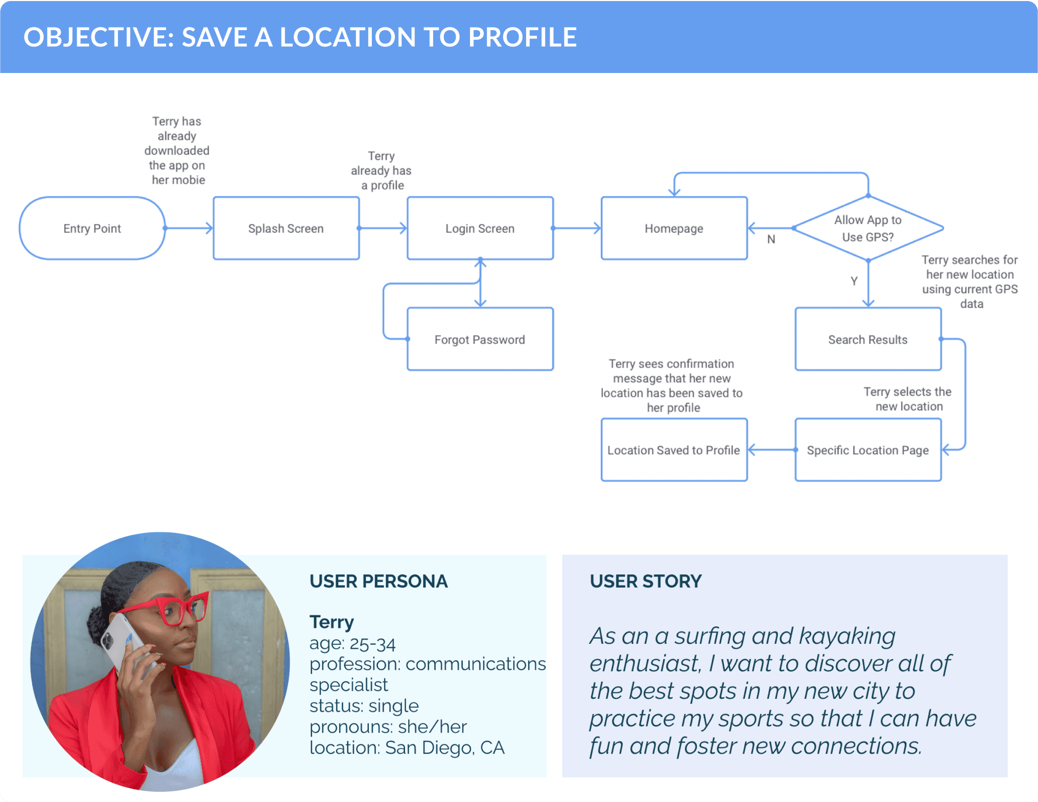
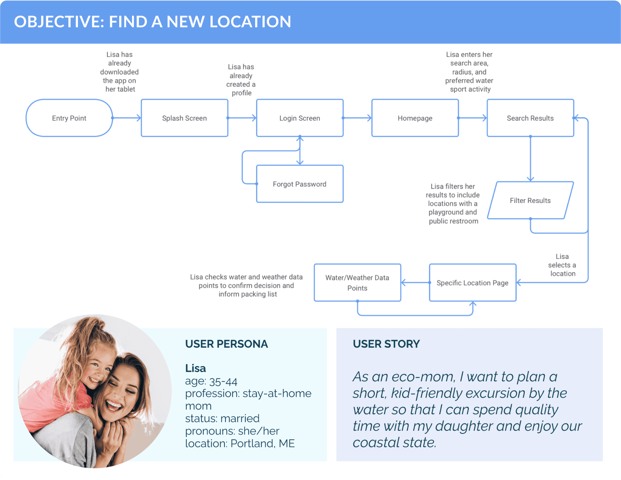
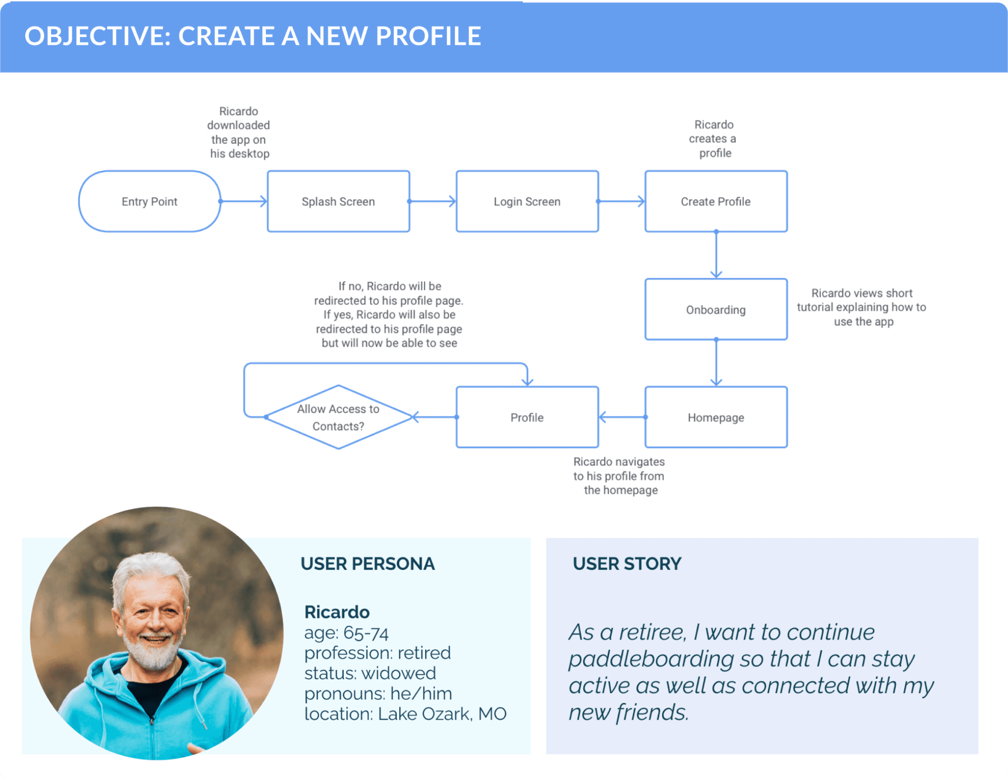
User flows envision how each user persona would move through a specific task using the app. Put together, they help to piece together a larger picture of how the app would function as a whole.

WIREFRAMES
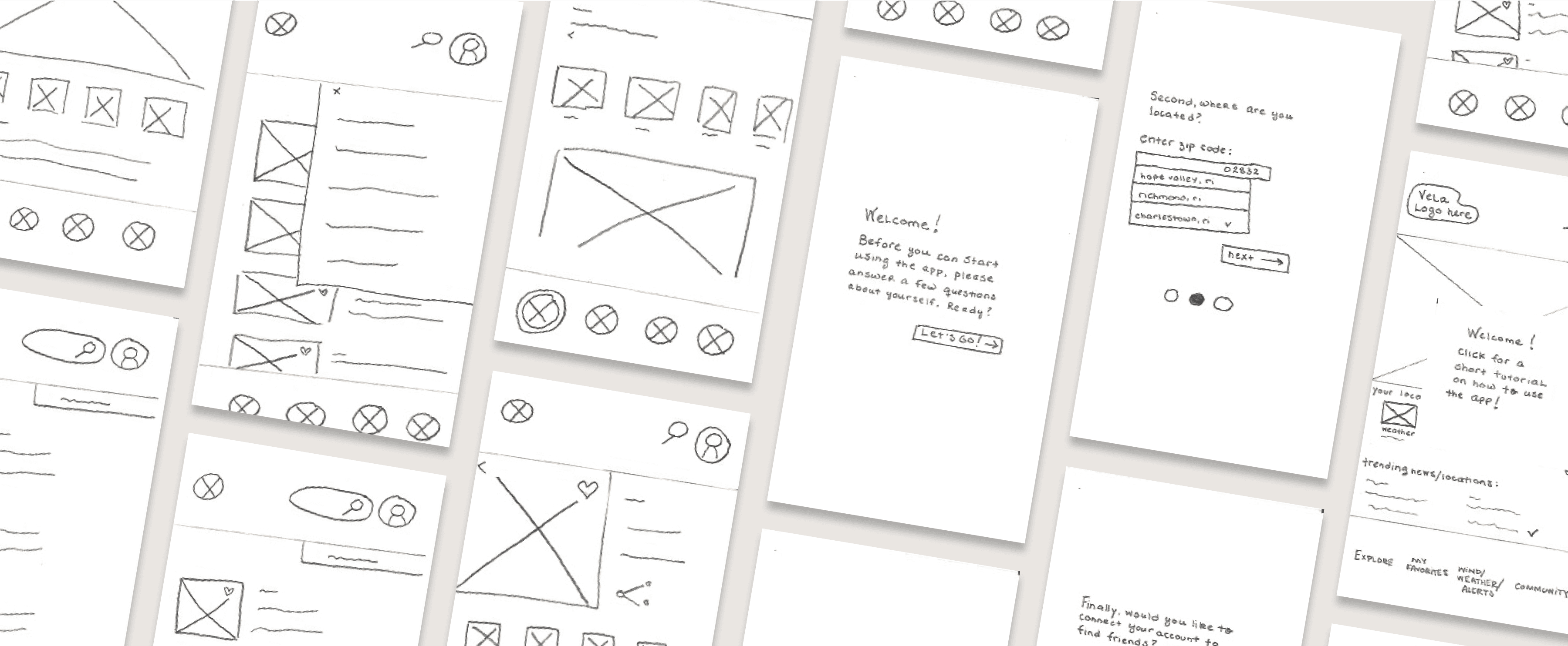
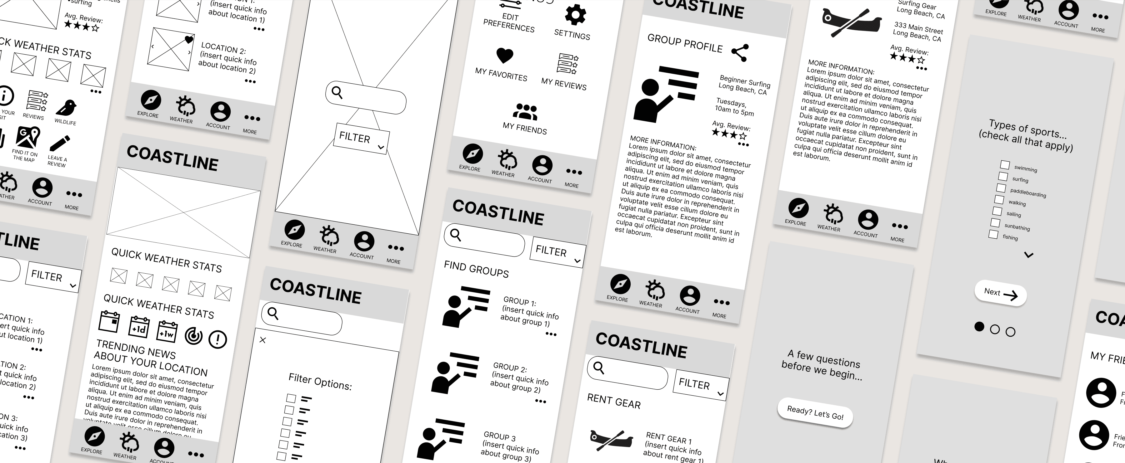
Paper and low-fidelity wireframes are where the app begins to come to life. Using a working sitemap and the user flows as a guide, each frame is imagined and quickly rendered.
PAPER PROTOTYPES
LOW-FIDELITY WIREFRAMES
USABILITY TESTING
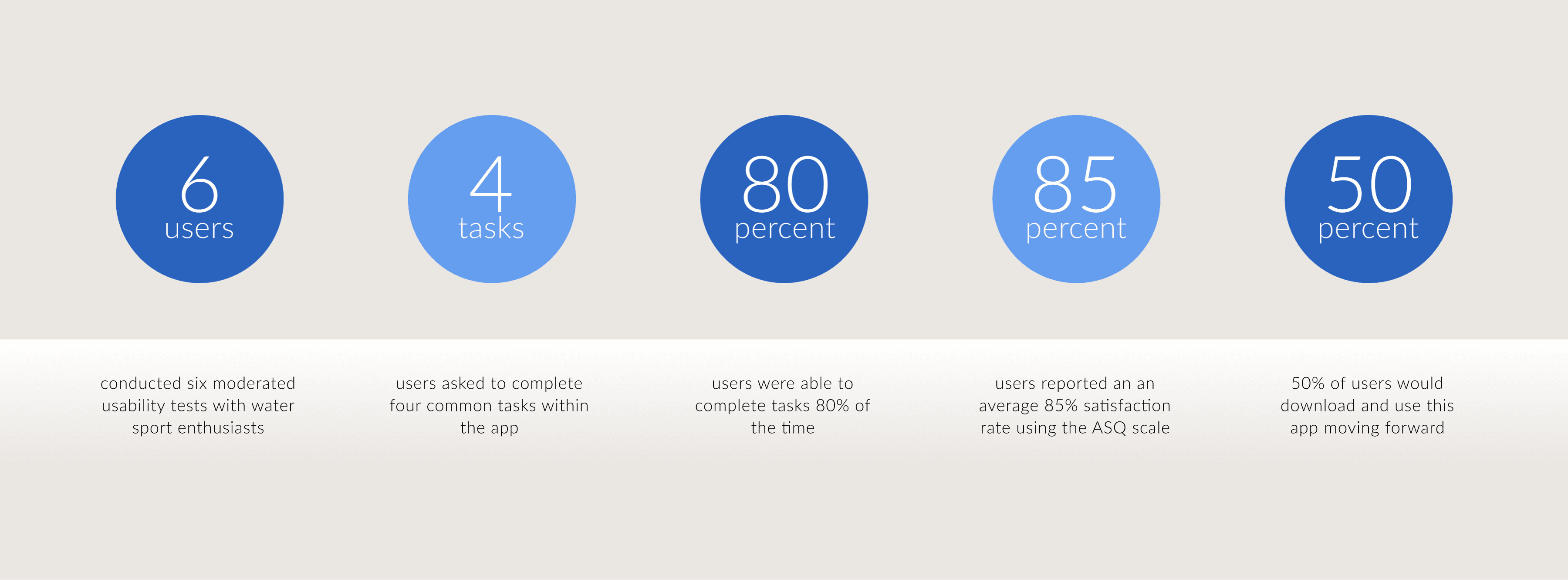
Usability testing brings the design back to the user. By testing how users move through the app to complete specific assigned tasks, I measured learnability, efficiency, errors, and user satisfaction. Using affinity mapping, I organized the results and translated them into to actionable steps that I could use moving forward in the design process.

DESIGN SYSTEM
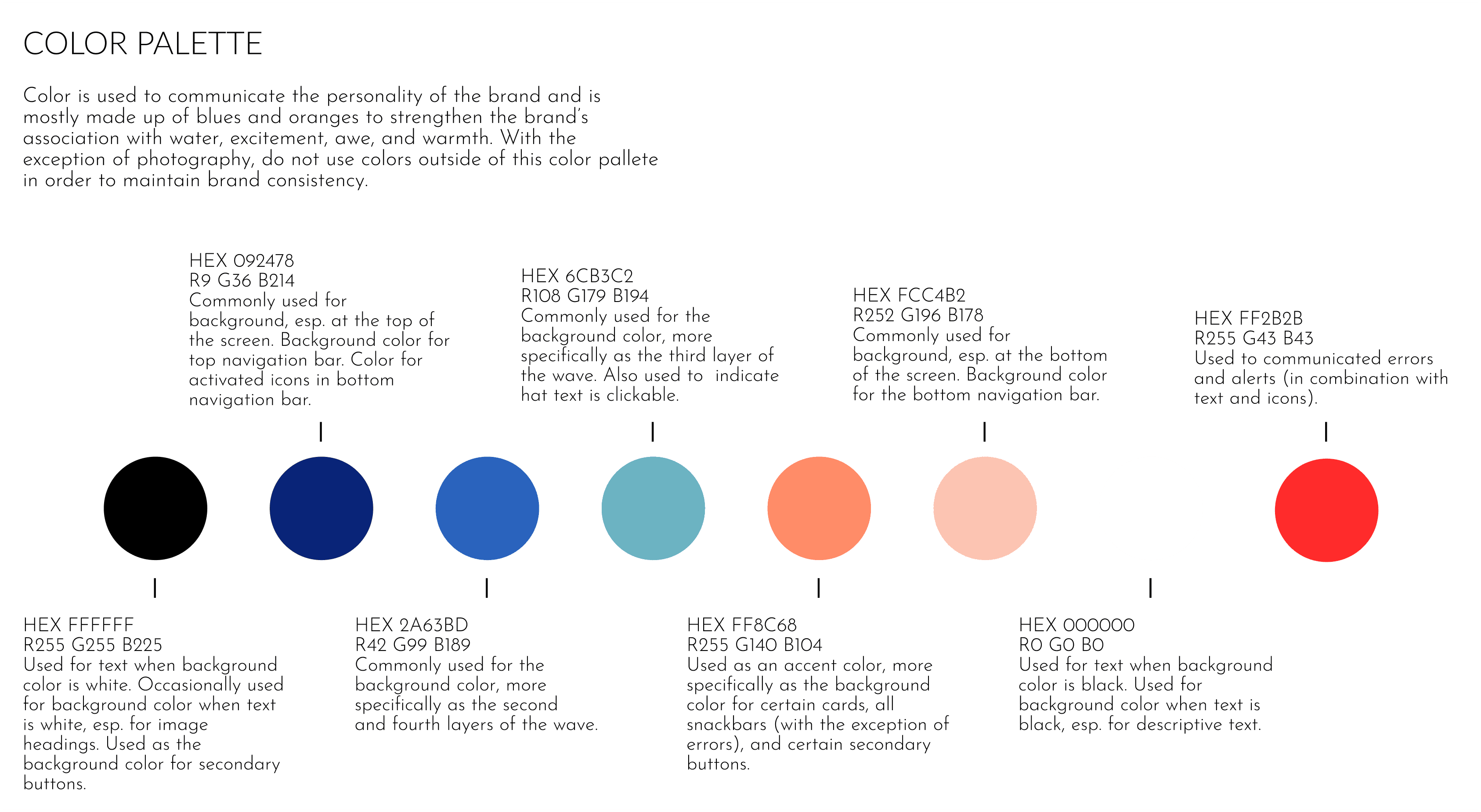
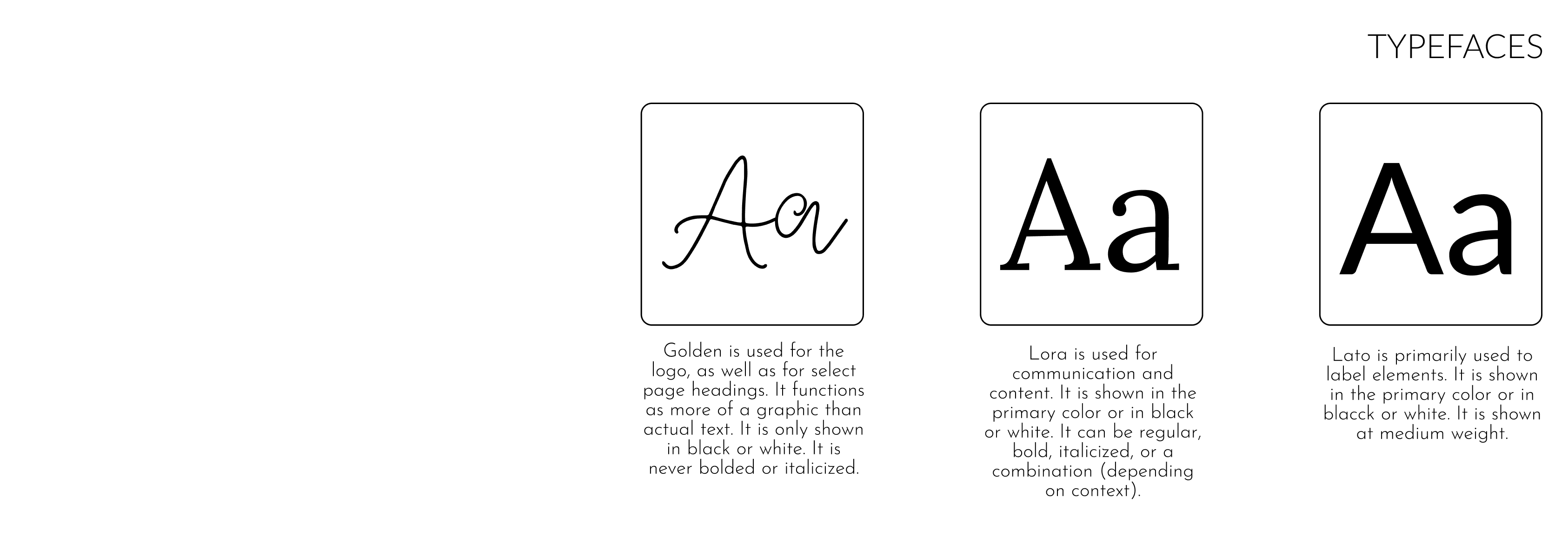
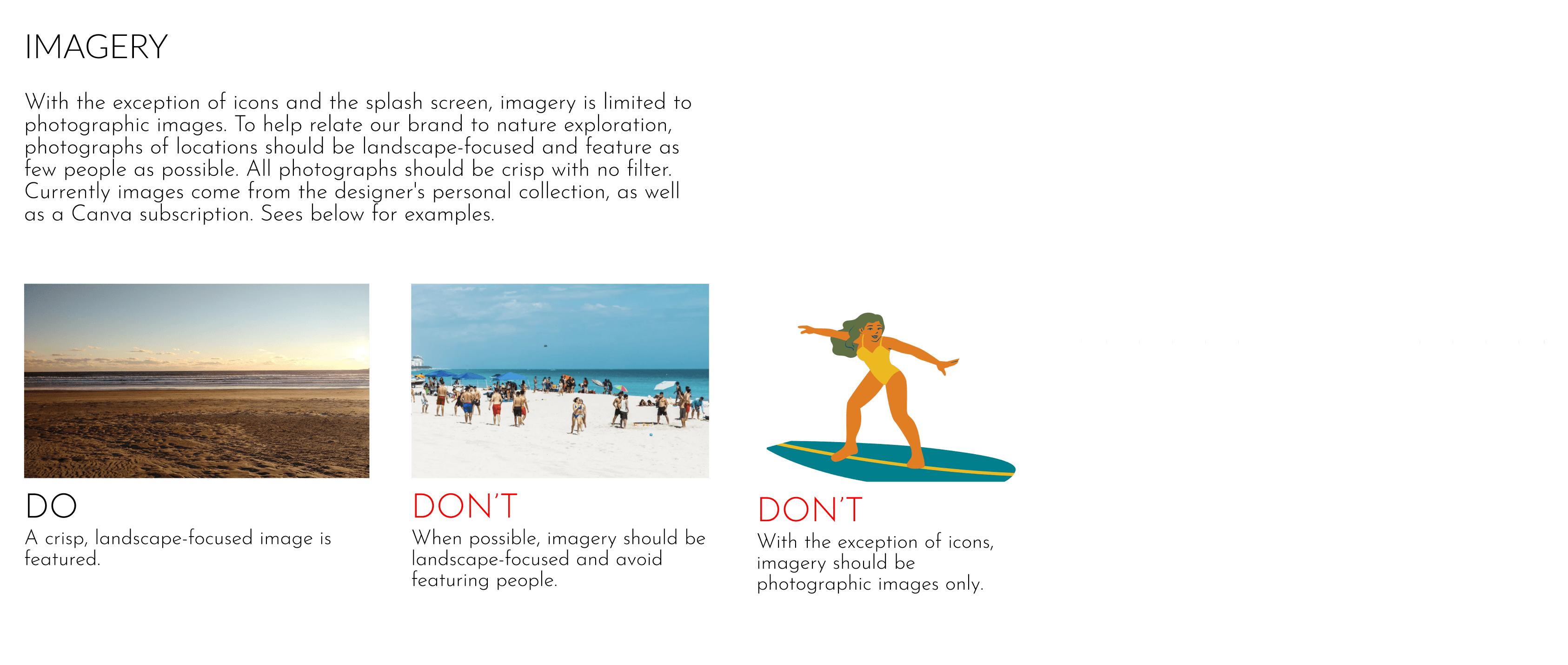
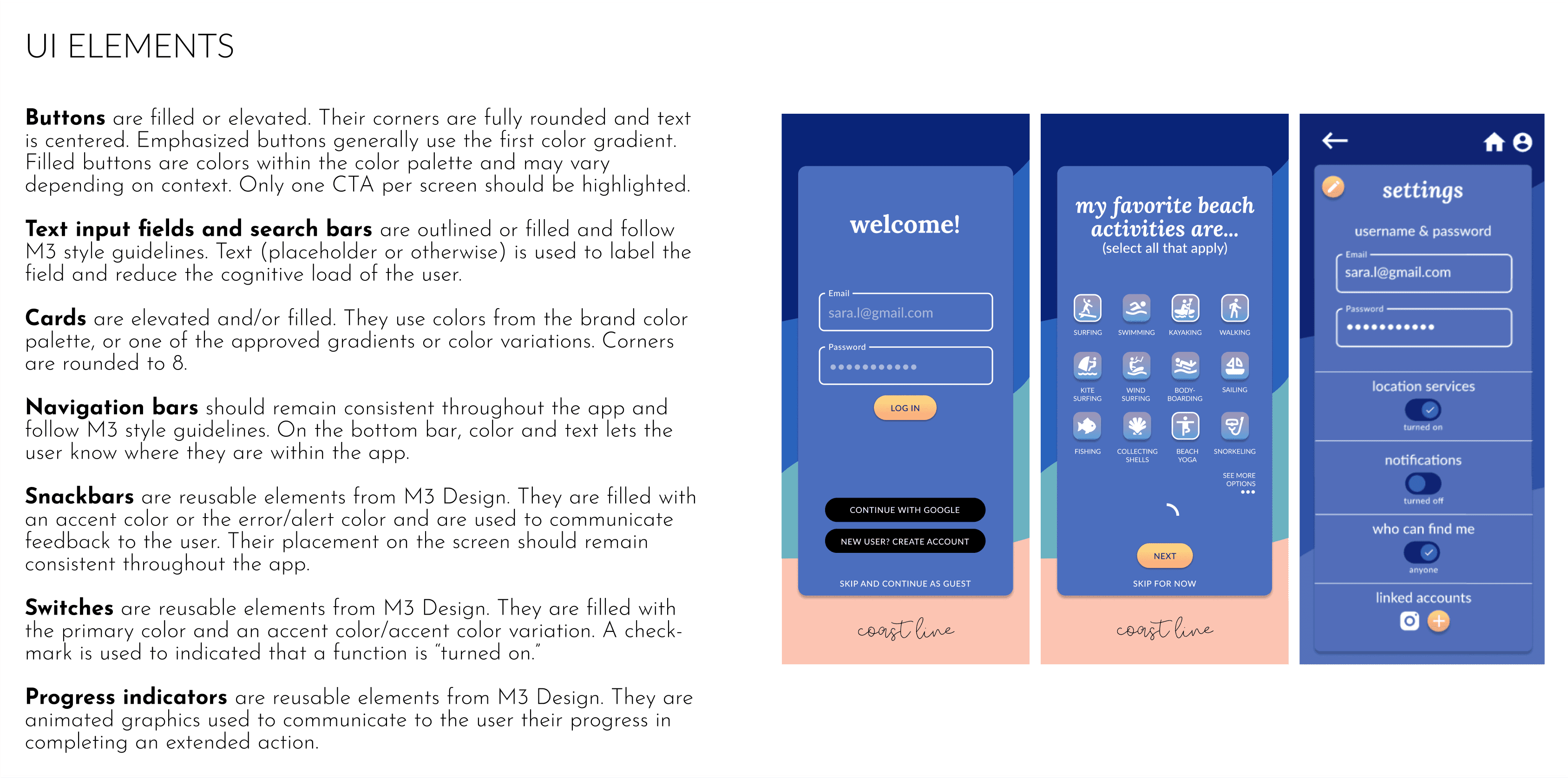
With confidence in user-tested site architecture, I could truly move forward in the visual design stage. By drawing on my knowledge of various design principles and strategies, I created a working design language system to promote cohesion and visual consistency throughout the design.


MOCKUPS AND A POLISHED PROTOTYPE
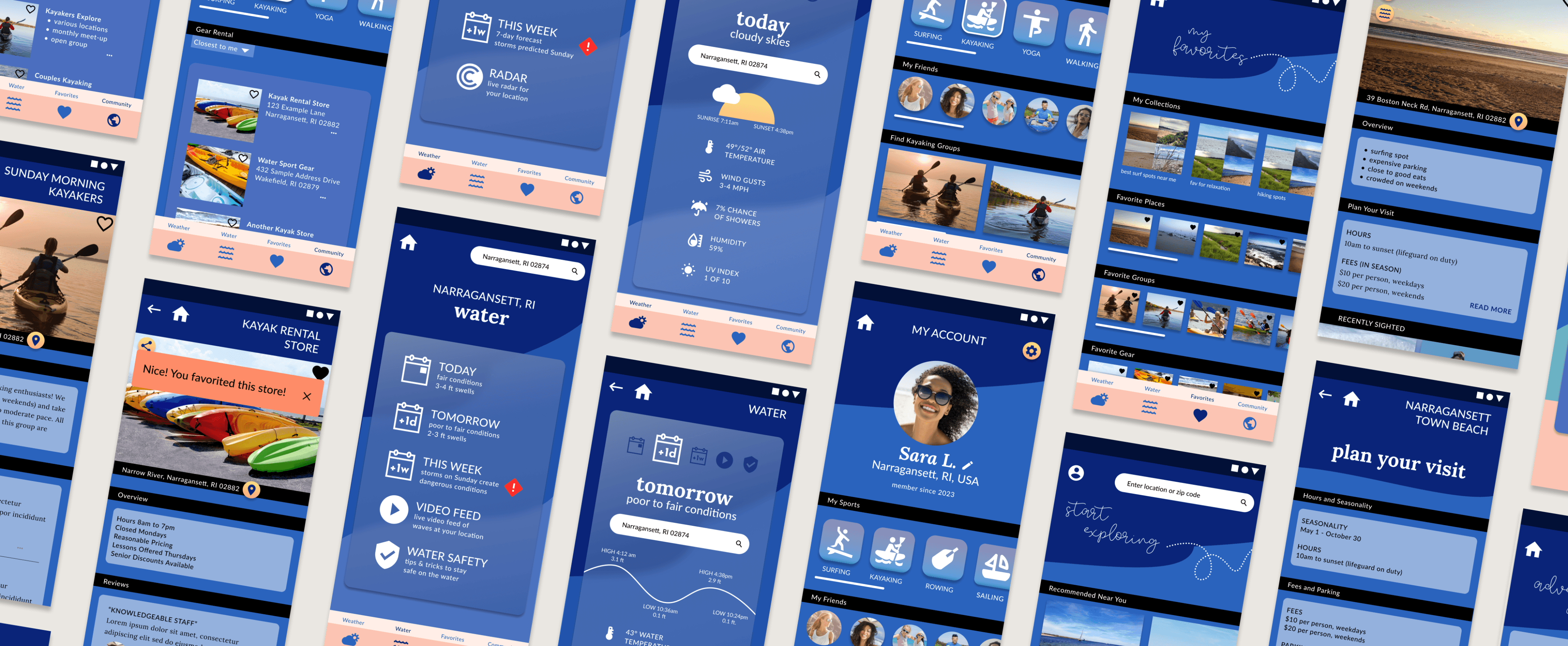
The mockups and current prototype found below are the result of constant redesign propelled by a deepening understanding of visual design principles, peer review, and accessible design guidelines.
Explore the interactive prototype here.
CONCLUSION
Coastline is an ambitious project that went well beyond just a weather app. I believe that it was successful in its original goal to help users digest multiple weather and water data points and that it added to that goal by connecting users to a sense of place.
As I saw this project through from its conception to a working prototype, it was an excellent learning experience for me as a UX designer. I enjoyed challenging my assumptions and putting my designs to the test with real users in order to continually iterate better design.
For me, the appeal of iterative design is that it accommodates change in real time based on user needs. The downside is then that our work is never truly finished. As Coastline continues to evolve, I look forward to polishing its UI, improving functionality and adding assets based on user needs and wants.
THANK YOU